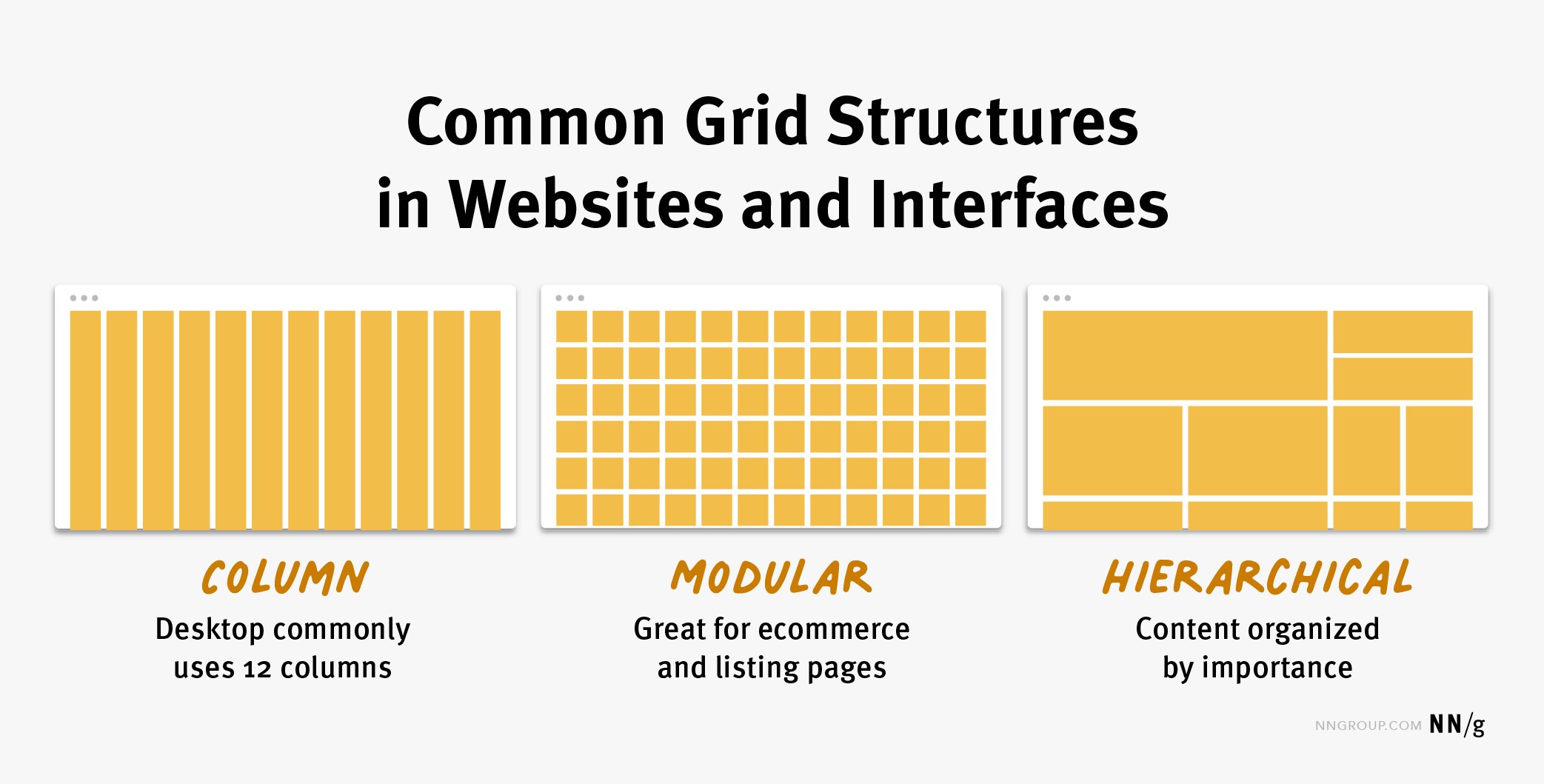
Grid examples unveil the power of structure in design. From the clean lines of a square grid to the organic flow of a hexagonal one, understanding grid systems unlocks the ability to create visually appealing and functionally efficient designs across diverse applications. This exploration delves into the various types of grids, their practical applications in web design, graphic design, and beyond, and how to create custom grid systems tailored to your specific needs.
We’ll cover everything from responsive design challenges to advanced techniques, providing a comprehensive overview of this essential design element.
This journey through the world of grid examples will equip you with the knowledge to leverage the power of structure in your own projects. Whether you’re a seasoned designer or just starting out, understanding grids is key to creating visually stunning and user-friendly designs that truly resonate with your audience. We’ll explore the intricacies of different grid types, their strengths and weaknesses, and how to effectively implement them in various design contexts, providing practical examples and insights along the way.
Types of Grids
Grid systems are fundamental to design, providing structure and visual harmony. Understanding the different types of grids allows designers to choose the optimal framework for their specific project, maximizing visual impact and usability. The choice depends heavily on the nature of the content and the desired aesthetic.
This section explores various grid types, highlighting their strengths and weaknesses, and providing detailed descriptions to facilitate their conceptualization and practical application.
Square Grids
Square grids, characterized by their uniformity, offer a clean and balanced aesthetic. Each cell within the grid is a perfect square, creating a highly structured and predictable layout. This simplicity makes them incredibly versatile, suitable for a wide range of applications from website layouts to print designs.
Imagine a chessboard: that’s a perfect example of a square grid. The equal dimensions of each square create a sense of order and stability. This is particularly beneficial when dealing with uniform content, such as a gallery of similarly sized images or a list of items with consistent spacing requirements.
| Grid Type | Description | Advantages | Disadvantages |
|---|---|---|---|
| Square Grid | A grid composed of uniformly sized squares. | Simplicity, balance, ease of use, suitable for uniform content. | Can feel monotonous if not carefully designed, less flexible for varied content sizes. |
| Rectangular Grid | A grid with rectangular cells; typically wider than they are tall, or vice-versa. | Flexibility in accommodating different content proportions, more dynamic than square grids. | Can be more challenging to design consistently, requires careful attention to proportions. |
| Hexagonal Grid | A grid using hexagons as its basic unit. | Visually interesting, efficient use of space, suitable for organic layouts. | More complex to design and implement, less intuitive for users accustomed to square/rectangular layouts. |
| Polar Grid | A grid radiating outwards from a central point, like spokes on a wheel. | Effective for emphasizing a central focal point, creates a dynamic and visually engaging layout. | Can be difficult to manage content consistently, not suitable for all types of content. |
Rectangular Grids
Rectangular grids offer more flexibility than square grids. By varying the ratio of width to height, designers can create a more dynamic and visually interesting layout. This adaptability makes them ideal for content with varying dimensions, such as text blocks and images of different aspect ratios. Think of a standard page layout in a book or magazine; the text blocks and image placements often utilize a rectangular grid.
Visualize a grid where the cells are twice as wide as they are tall. This allows for longer text lines or wider images, creating a different visual rhythm than a square grid. The proportions can be adjusted to suit the specific needs of the design.
Hexagonal Grids
Hexagonal grids provide a unique and visually appealing alternative to square and rectangular grids. Their six-sided structure allows for a more organic and less rigid feel. They also offer a more efficient use of space, as hexagons can tessellate (fit together without gaps) more effectively than squares. Imagine a honeycomb; this is a perfect natural example of a hexagonal grid.
Do not overlook the opportunity to discover more about the subject of cost of solar panels for off grid living.
Envision a grid where each cell is a regular hexagon. The arrangement allows for a flowing, almost organic feel, unlike the more structured lines of square or rectangular grids. This is particularly effective for displaying items that don’t fit neatly into square or rectangular shapes.
Polar Grids
Polar grids radiate outwards from a central point, creating a dynamic and visually engaging layout. This type of grid is particularly effective for emphasizing a central focal point, such as a logo or a key piece of information. Imagine the spokes of a wheel extending outwards; this visual representation effectively illustrates the structure of a polar grid. The content is organized in concentric circles or radiating lines from the center.
Picture a target, with concentric circles representing different levels of information or importance. The central point holds the primary focus, while information radiates outwards in a visually organized manner. This is especially effective for showcasing hierarchical data or emphasizing a central theme.
Grid Applications in Design: Grid Examples

Grid systems, the unsung heroes of visual organization, are fundamental to creating aesthetically pleasing and highly functional designs across various platforms. Their application extends far beyond simple alignment; grids provide a robust framework for establishing visual hierarchy, ensuring consistency, and ultimately, enhancing the user experience. Understanding how grids function in different design contexts is key to mastering the art of visual communication.
The power of the grid lies in its ability to unify disparate elements into a cohesive whole. It acts as a blueprint, guiding the placement of text, images, and other design components, preventing visual chaos and promoting a sense of order and balance. This structured approach not only improves the visual appeal but also significantly enhances readability and navigation, particularly crucial in web and UI/UX design.
Grid Applications in Graphic Design
Grids are indispensable tools in graphic design, providing a framework for organizing complex layouts in print materials like brochures, posters, and magazines. They ensure consistency across multiple pages, maintaining a unified visual identity.
- Magazine Layouts: Grids dictate the placement of articles, images, and advertisements, ensuring a balanced and visually appealing flow throughout the publication. Imagine a magazine spread: the grid guides the placement of headlines, body text, sidebars, and images, creating a visually consistent and engaging reading experience. The consistent column widths and margins created by the grid allow for easy reading and prevent a cluttered appearance.
- Poster Design: A grid helps organize text and imagery on a poster, creating a hierarchy of information and guiding the viewer’s eye. For example, a poster advertising a concert might use a grid to position the band’s name prominently, followed by supporting information like date, time, and venue, all while incorporating an eye-catching image.
- Brochure Design: Grids are essential for creating consistent and professional-looking brochures. They ensure that information is presented clearly and logically across different panels, enhancing readability and overall impact. A tri-fold brochure, for instance, benefits greatly from a grid system, ensuring that text and images are consistently aligned across all three panels, creating a cohesive and professional feel.
Grid Applications in Web Design
In web design, grids provide a structure for arranging content on a webpage, ensuring responsiveness and consistency across different screen sizes. They are crucial for creating user-friendly and visually appealing websites.
- Responsive Web Design: Grids are fundamental to responsive web design, allowing content to adapt seamlessly to various screen sizes (desktops, tablets, and smartphones). A fluid grid, for example, adjusts its column widths based on the screen size, maintaining a visually appealing layout across all devices.
- Website Layouts: Grids define the structure of a website, determining the placement of navigation menus, headers, footers, and content areas. A well-defined grid ensures that all elements are positioned consistently, creating a clean and organized user interface.
- E-commerce Websites: Grids are particularly useful for organizing product displays on e-commerce websites, creating a visually appealing and easy-to-navigate product catalog. A grid system allows for consistent spacing and alignment of product images, descriptions, and prices, enhancing the overall shopping experience.
Grid Applications in UI/UX Design, Grid examples
Grids are essential for creating intuitive and user-friendly interfaces in applications and software. They ensure consistency and organization of elements within the user interface.
- Mobile App Design: Grids provide a framework for arranging elements on mobile app screens, ensuring consistency and usability across different devices. A well-designed grid helps organize buttons, text fields, and other UI elements, creating a clean and intuitive interface.
- Dashboard Design: Grids are invaluable for creating clear and organized dashboards, allowing for efficient presentation of information. A grid helps arrange data visualizations, charts, and other elements, ensuring readability and ease of understanding.
- Form Design: Grids help organize form elements, ensuring that fields are aligned consistently, improving usability and reducing errors. A grid ensures that labels and input fields are properly aligned, improving the overall visual appeal and usability of the form.
Print vs. Digital Grid Usage
While both print and digital design utilize grids, their applications differ slightly. Print design often employs fixed grids, where column widths and margins are predetermined and remain consistent throughout the publication. Digital design, however, frequently utilizes fluid grids that adapt to different screen sizes and resolutions, ensuring responsiveness and optimal viewing experience across various devices. Print grids prioritize static layout and visual harmony on a single, physical page, whereas digital grids emphasize adaptability and user experience across a range of screen sizes and orientations.
Designing a Website Homepage Using a Grid System
Designing a website homepage using a grid involves several steps. First, define the overall structure and content hierarchy. Then, choose a grid system (e.g., 12-column grid) and determine the number of columns for different sections (header, navigation, content, sidebar, footer). Next, create mockups to visualize the layout and placement of elements. Finally, implement the design using CSS, ensuring responsiveness across various devices.
For instance, a typical homepage might use a 12-column grid with a 3-column header for the logo and navigation, a 9-column main content area, and a 12-column footer. This structure ensures a balanced and visually appealing layout, while also allowing for easy adaptation to different screen sizes.
Mastering grid systems is not just about aesthetics; it’s about building a solid foundation for effective and engaging design. By understanding the different types of grids, their applications, and the techniques for creating custom responsive grids, you can elevate your designs to a new level of sophistication and usability. The power of the grid lies in its ability to unify diverse elements into a cohesive and harmonious whole, creating a design that is both beautiful and functional.
So, embrace the grid – it’s your secret weapon for creating truly impactful designs.
FAQ Section
What is the difference between a modular grid and a fluid grid?
A modular grid uses fixed-width columns, while a fluid grid uses percentage-based widths, adapting to different screen sizes.
How do I choose the right grid dimensions for my project?
Consider your content, target audience, and design goals. Experiment with different dimensions to find what works best.
What are some common mistakes to avoid when using grid systems?
Ignoring responsive design, using overly complex grids, and neglecting visual hierarchy are common pitfalls.
Are there any tools to help create and visualize grid systems?
Yes, numerous software applications and online tools exist to assist in grid creation and visualization.


